Dirty Girl Soap Co. - Brand Identity and Packaging Design
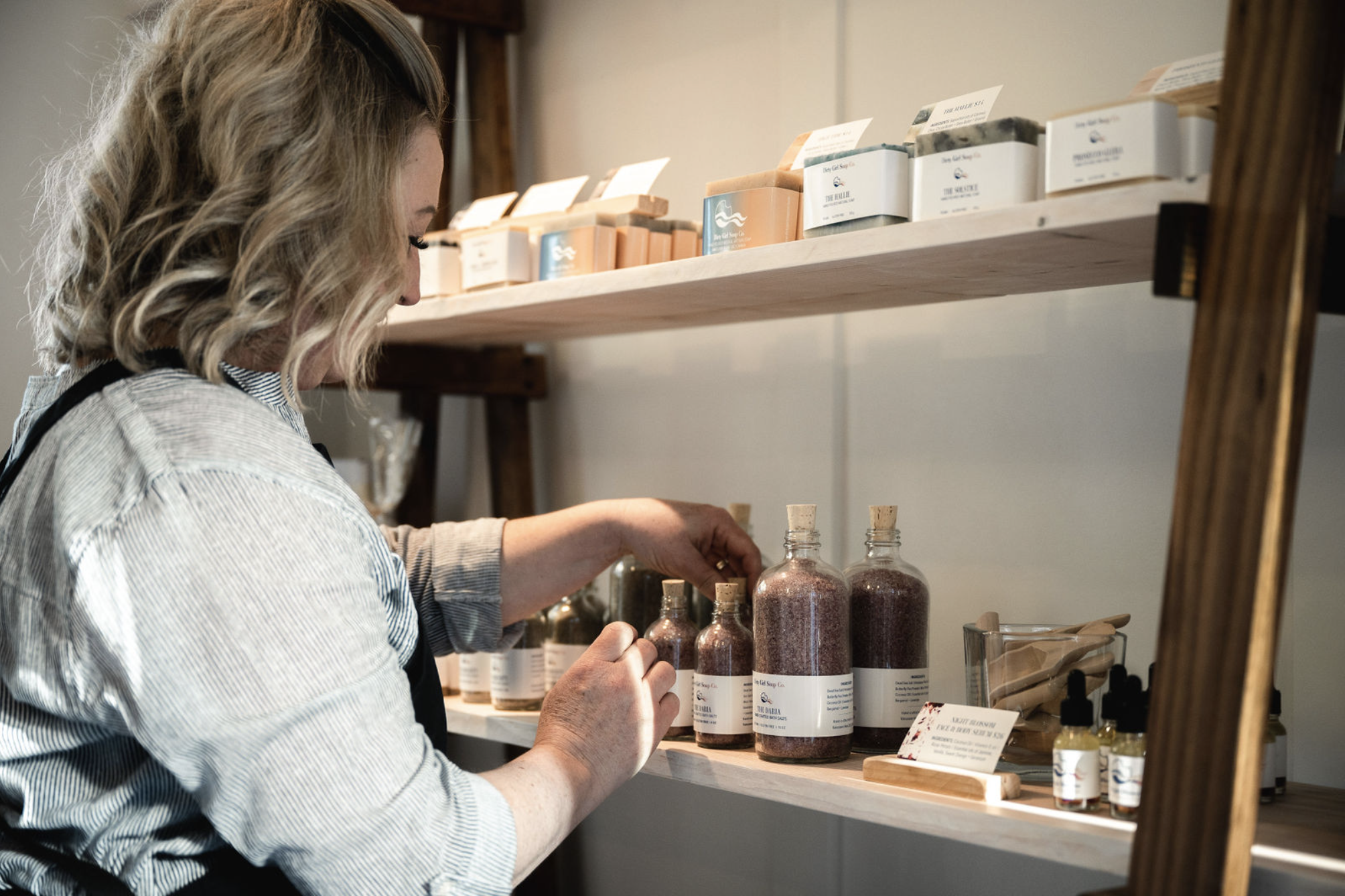
Dirty Girl Soap Co. is a soap company located on the picturesque Vancouver Island in British Columbia, Canada. Specializing in hand-poured, natural, and artisanal soaps, bath and body products, candles, and more, the company is committed to crafting safe and luxurious items using only top-quality, natural ingredients. The brand personality of Dirty Girl Soap Co. is outdoorsy and feminine, reflecting the beauty of their coastal community nestled between mountains, forests, and the Pacific Ocean.
We had the great pleasure of working with Dirty Girl Soap Co. from the very first stages of their company’s development. With thoughtful attention to detail and a thorough understanding of their brand ethos, we were able to create a logo and identity system, as well as packaging and marketing material, that truly reflects the brand’s spirit.

Project Objectives
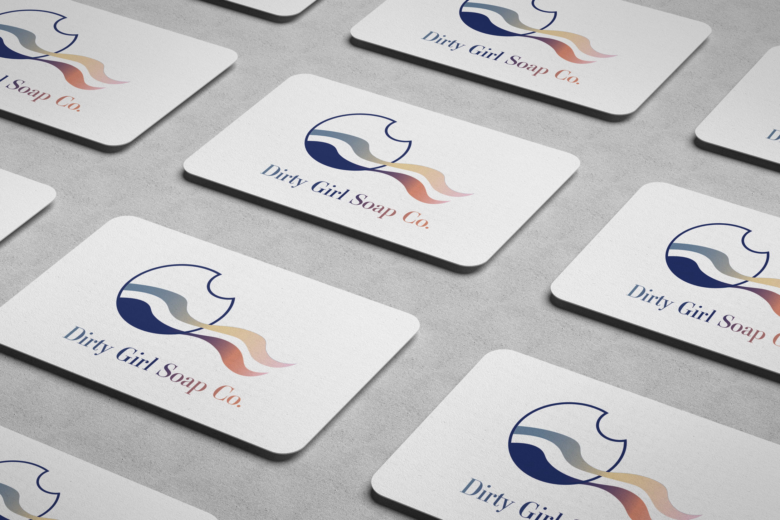
Dirty Girl Soap Co. sought to establish a strong and unique brand identity that would capture the essence of their company and products. They required a logo design that emphasized their mail-order subscription box service while reflecting the Divine Feminine symbolism through elements like ocean waves, a crescent moon, and flowing hair. In addition to the logo, they needed branding elements, packaging designs, a website, promotional materials, and social media assets.
Process Notes
The design process began with in-depth research into Dirty Girl Soap Co.’s values, vision, and target audience. Understanding their coastal location and commitment to natural products played a crucial role in the design direction.
Several design concepts were developed, all keeping in mind the client’s desire for an elevated, feminine and playful brand image.

Dirty Girl Soap Co. began with a subscription box business model. The logo design is intentionally reminiscent of a vintage postage stamp and includes a crisp outline of a soap bubble. Some of the design elements can also be interpreted as ocean waves, representing both the coastal location and the cleansing nature of their products. Also hidden within the design elements are hints of a crescent moon and flowing hair, symbolizing the Divine Feminine.

The logo and packaging design for Dirty Girl Soap Co. successfully captured the essence of the brand, highlighting its commitment to natural, artisanal products while celebrating its coastal origins. The branding elements, packaging, website, and promotional materials were designed to create a cohesive and memorable brand experience for customers.
Dirty Girl Soap Co. now has a distinct and recognizable identity, which contributes to its success as a leading artisanal soap company on beautiful Vancouver Island.